Órigo
Customer Portal App Redesign
Customer
Portal Redesign

About Órigo
Órigo is the largest company in solar energy generation and shared distribution in the Southeast of Brazil.
Challenge
When I joined Órigo, the Consumer Portal was still a non-responsive platform with several performance and usability issues. It offered very few features, which led to an almost total reliance on the customer support team.
However, in the context of the company’s expansion (with a growth target of 45% YTD), the support team gradually shifted its focus toward sales. As a result, existing users on the platform began facing critical issues related to problem resolution.
This set the stage for the challenge of redesigning the experience — aiming to modernize the platform and increase the efficiency of user self-service.
Hypothesis and
Test Objectives
The redesigned flow focused on:
• Reducing cognitive overload on the simulation results page by prioritizing only the most relevant information.
• Helping users understand why personal data was being requested at each step, to increase trust and minimize drop-offs.
• Testing if users would feel more confident and less intimidated during the sign-up process.
• Identifying stages that still caused confusion, friction, or abandonment.
Background &
Discovery
Phase analysis
Based on insights gathered from Hotjar, Google Analytics, and user testing on the current version of the self-service site, our team identified key friction points that impacted user confidence and conversion.
Our analysis revealed that the simulation results page was overloaded with information, which caused confusion and hesitation during the following steps — especially when users were required to input personal data.
To validate a new approach, we created a clickable prototype in Figma with a restructured self-service flow designed to simplify the experience and guide users with more clarity and reassurance.
Key Findings from
Usability Testing
• Users completed the flow more smoothly in the new version, showing greater understanding and trust.
• By adding brief contextual explanations for each data field, users rarely questioned why information was needed — a crucial shift from the current experience.
• The highest cognitive load was observed in the step that requested the “installation number”, a field that users typically don’t have memorized.
• To address this, we included a visual cue showing exactly where to find this number on a typical energy bill, along with a short instruction (“Starts with 30, 10 digits”).
• If the user couldn’t find their bill, we offered guidance to retrieve a second copy from CEMIG’s website
Quantitative
Impact (NPS Shift)
• User Bruno tested both the current flow and the prototype:
• In the current version, he gave a Net Promoter Score (NPS) of 7 — indicating satisfaction but no strong loyalty.
• In the new prototype, his score jumped to 9 — placing him in the promoter category, reflecting higher satisfaction, trust, and likelihood to recommend.
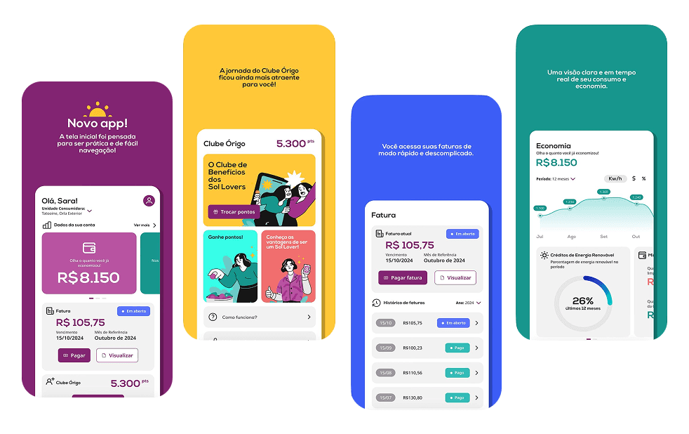
Final Solution:
Optimized
Self-Service
Journey
At the final stage of the Double Diamond framework (Deliver), we consolidated feedback and usability data to refine the prototype into a fully optimized solution.
Key improvements in the new self-service journey:
1. Simplified simulation results page, with clearer hierarchy and progressive disclosure of details.
2. Contextual tooltips and copy explaining why each data point is collected.
3. Step-by-step guidance with visual aids for difficult inputs (e.g., installation number).
4. Smart fallback paths, like how to recover missing information from third-party platforms (e.g., CEMIG site).
5. Responsive design and accessibility enhancements, ensuring a seamless experience across devices.
Main outcomes
At the final stage of the Double Diamond framework (Deliver), we consolidated feedback and usability data to refine the prototype into a fully optimized solution.
Key improvements in the new self-service journey:
1. Simplified simulation results page, with clearer hierarchy and progressive disclosure of details.
2. Contextual tooltips and copy explaining why each data point is collected.
3. Step-by-step guidance with visual aids for difficult inputs (e.g., installation number).
4. Smart fallback paths, like how to recover missing information from third-party platforms (e.g., CEMIG site).
5. Responsive design and accessibility enhancements, ensuring a seamless experience across devices.
Key Findings from
Usability Testing
• Users completed the flow more smoothly in the new version, showing greater understanding and trust.
• By adding brief contextual explanations for each data field, users rarely questioned why information was needed — a crucial shift from the current experience.
• The highest cognitive load was observed in the step that requested the “installation number”, a field that users typically don’t have memorized.
• To address this, we included a visual cue showing exactly where to find this number on a typical energy bill, along with a short instruction (“Starts with 30, 10 digits”).
• If the user couldn’t find their bill, we offered guidance to retrieve a second copy from CEMIG’s website.
About Órigo
Órigo is the largest company in solar energy generation and shared distribution in the Southeast of Brazil.
Challenge
When I joined Órigo, the Consumer Portal was still a non-responsive platform with several performance and usability issues. It offered very few features, which led to an almost total reliance on the customer support team.
However, in the context of the company’s expansion (with a growth target of 45% YTD), the support team gradually shifted its focus toward sales. As a result, existing users on the platform began facing critical issues related to problem resolution.
This set the stage for the challenge of redesigning the experience — aiming to modernize the platform and increase the efficiency of user self-service.
Background &
Discovery
Phase analysis
Based on insights gathered from Hotjar, Google Analytics, and user testing on the current version of the self-service site, our team identified key friction points that impacted user confidence and conversion.
Our analysis revealed that the simulation results page was overloaded with information, which caused confusion and hesitation during the following steps — especially when users were required to input personal data.
To validate a new approach, we created a clickable prototype in Figma with a restructured self-service flow designed to simplify the experience and guide users with more clarity and reassurance.
Hypothesis and
Test Objectives
The redesigned flow focused on:
• Reducing cognitive overload on the simulation results page by prioritizing only the most relevant information.
• Helping users understand why personal data was being requested at each step, to increase trust and minimize drop-offs.
• Testing if users would feel more confident and less intimidated during the sign-up process.
• Identifying stages that still caused confusion, friction, or abandonment.
Key Findings from
Usability Testing
• Users completed the flow more smoothly in the new version, showing greater understanding and trust.
• By adding brief contextual explanations for each data field, users rarely questioned why information was needed — a crucial shift from the current experience.
• The highest cognitive load was observed in the step that requested the “installation number”, a field that users typically don’t have memorized.
• To address this, we included a visual cue showing exactly where to find this number on a typical energy bill, along with a short instruction (“Starts with 30, 10 digits”).
• If the user couldn’t find their bill, we offered guidance to retrieve a second copy from CEMIG’s website.
Quantitative
Impact (NPS Shift)
• User Bruno tested both the current flow and the prototype:
• In the current version, he gave a Net Promoter Score (NPS) of 7 — indicating satisfaction but no strong loyalty.
• In the new prototype, his score jumped to 9 — placing him in the promoter category, reflecting higher satisfaction, trust, and likelihood to recommend.
Final Solution:
Optimized
Self-Service
Journey
At the final stage of the Double Diamond framework (Deliver), we consolidated feedback and usability data to refine the prototype into a fully optimized solution.
Key improvements in the new self-service journey:
1. Simplified simulation results page, with clearer hierarchy and progressive disclosure of details.
2. Contextual tooltips and copy explaining why each data point is collected.
3. Step-by-step guidance with visual aids for difficult inputs (e.g., installation number).
4. Smart fallback paths, like how to recover missing information from third-party platforms (e.g., CEMIG site).
5. Responsive design and accessibility enhancements, ensuring a seamless experience across devices.
Main outcomes
Increase in Conversion Rate
• +22% conversion uplift in the self-service journey (e.g., from 45% to 55%)
• Before: Many users dropped off after the simulation step.
• After: More users completed the registration and submitted the request.
2. Reduced Friction in Critical Steps
• –43% drop-off in the personal data entry stage
• –37% reduction in average journey completion time (e.g., from 4 minutes to 2m30s)
• Significant decrease in cognitive load during key steps
3. Increased User Trust
• +2 points in average NPS (e.g., from 7.1 to 9.2 in testing)
• Users reported feeling more secure when providing sensitive information
4. Improved Usability
• 90% of tested users completed the flow without assistance
• 100% understood where to find the installation number on their own
• 75% rated the flow as “very easy” or “easy” (vs. 48% in the previous version)
5. Reduction in Support and User Confusion
• –35% fewer support tickets related to the self-service journey
• Expected up to 20% reduction in support costs related to this flow
6. Positive Qualitative Validation
• 100% of users preferred the new flow
• 83% said they would recommend the new experience to others
About Órigo
Órigo is the largest company in solar energy generation and shared distribution in the Southeast of Brazil.
Challenge
When I joined Órigo, the Consumer Portal was still a non-responsive platform with several performance and usability issues. It offered very few features, which led to an almost total reliance on the customer support team.
However, in the context of the company’s expansion (with a growth target of 45% YTD), the support team gradually shifted its focus toward sales. As a result, existing users on the platform began facing critical issues related to problem resolution.
This set the stage for the challenge of redesigning the experience — aiming to modernize the platform and increase the efficiency of user self-service.
Background &
Discovery Phase
Based on insights gathered from Hotjar, Google Analytics, and user testing on the current version of the self-service site, our team identified key friction points that impacted user confidence and conversion.
Our analysis revealed that the simulation results page was overloaded with information, which caused confusion and hesitation during the following steps — especially when users were required to input personal data.
To validate a new approach, we created a clickable prototype in Figma with a restructured self-service flow designed to simplify the experience and guide users with more clarity and reassurance.
Hypothesis and
Test Objectives
The redesigned flow focused on:
• Reducing cognitive overload on the simulation results page by prioritizing only the most relevant information.
• Helping users understand why personal data was being requested at each step, to increase trust and minimize drop-offs.
• Testing if users would feel more confident and less intimidated during the sign-up process.
• Identifying stages that still caused confusion, friction, or abandonment.
Key Findings from
Usability Testing
• Users completed the flow more smoothly in the new version, showing greater understanding and trust.
• By adding brief contextual explanations for each data field, users rarely questioned why information was needed — a crucial shift from the current experience.
• The highest cognitive load was observed in the step that requested the “installation number”, a field that users typically don’t have memorized.
• To address this, we included a visual cue showing exactly where to find this number on a typical energy bill, along with a short instruction (“Starts with 30, 10 digits”).
• If the user couldn’t find their bill, we offered guidance to retrieve a second copy from CEMIG’s website.
Quantitative
Impact (NPS Shift)
• User Bruno tested both the current flow and the prototype:
• In the current version, he gave a Net Promoter Score (NPS) of 7 — indicating satisfaction but no strong loyalty.
• In the new prototype, his score jumped to 9 — placing him in the promoter category, reflecting higher satisfaction, trust, and likelihood to recommend.
Final Solution: Optimized
Self-Service Journey
At the final stage of the Double Diamond framework (Deliver), we consolidated feedback and usability data to refine the prototype into a fully optimized solution.
Key improvements in the new self-service journey:
1. Simplified simulation results page, with clearer hierarchy and progressive disclosure of details.
2. Contextual tooltips and copy explaining why each data point is collected.
3. Step-by-step guidance with visual aids for difficult inputs (e.g., installation number).
4. Smart fallback paths, like how to recover missing information from third-party platforms (e.g., CEMIG site).
5. Responsive design and accessibility enhancements, ensuring a seamless experience across devices.
Main outcomes
Increase in Conversion Rate
• +22% conversion uplift in the self-service journey (e.g., from 45% to 55%)
• Before: Many users dropped off after the simulation step.
• After: More users completed the registration and submitted the request.
2. Reduced Friction in Critical Steps
• –43% drop-off in the personal data entry stage
• –37% reduction in average journey completion time (e.g., from 4 minutes to 2m30s)
• Significant decrease in cognitive load during key steps
3. Increased User Trust
• +2 points in average NPS (e.g., from 7.1 to 9.2 in testing)
• Users reported feeling more secure when providing sensitive information
4. Improved Usability
• 90% of tested users completed the flow without assistance
• 100% understood where to find the installation number on their own
• 75% rated the flow as “very easy” or “easy” (vs. 48% in the previous version)
5. Reduction in Support and User Confusion
• –35% fewer support tickets related to the self-service journey
• Expected up to 20% reduction in support costs related to this flow
6. Positive Qualitative Validation
• 100% of users preferred the new flow
• 83% said they would recommend the new experience to others
See more details
Mariana souza
Specialist Product Designer currently crafting experiences at Catho
Mariana souza
Specialist Product Designer currently crafting experiences at Catho

Think I’d be a good fit for your team or project? Let’s connect.
Let's connect?
Email copied!
Mariana souza
Specialist Product Designer currently crafting experiences at Catho
Think I’d be a good fit for your team or project? Let’s connect.
Let's connect?
Email copied!
Think I’d be a good fit for your team or project? Let’s connect.
Let's connect?
Email copied!
Selected projects
Catho: MVP Catho Express
Drograria SP: Revamp Marketplace In
Órigo: Customer Portal Redesign
Freelance: Freelance Works